Reel hooks: how I write the first line, the cover and the end card
A hook above the first shot, a cover with no blink and an end card that asks for a share. How I reworked all my reels this week.
 Przemysław Filipiakcreator of delta240mvt
Wednesday evening, episode 26 of the series with the monk. A finished film, nice light, dad falling asleep on the sofa. And a first second in which nothing happens that would make you stay. That’s when I wrote Claude one sentence: a hook needs context, surprise or a curiosity gap. By the end of the week I had reworked every reel that hadn’t gone out yet to fit that.
This post is about three places in a reel that someone sees before deciding whether to stay: the first sentence above the first shot, the cover in the profile grid and the last seconds. In each of them I now have numbers instead of “more or less”.
Before I build anything, the idea has to have five stars
A hook won’t save a weak story. So I start earlier, with ideas. Every reel idea is a card for me: one sentence of situation, a punchline and a rating from one to five stars. This week I adopted a simple rule: only five-star cards go into production.
Sounds obvious, but I didn’t do it that way before. Season 13 had three reels, two of them from four-star cards. That same day I replaced one of them with a five-star card and simply threw the other one out, even though the script was ready. A waste of work? A bit. But the render, voice, cover and edit are a few hours per reel. I’d rather spend them on a story I believe in all the way.
When the five-star cards ran out, I reached for the best four-star ones. But reworked under the new rules: every card got a “who to send this to” field. If I can’t name one person who should get this reel from a friend, the card goes back on the shelf. That field comes back at the end of the reel, more on that below.
Thanks to that, two more seasons came together on Thursday and Friday, three reels in each series. No debate about which idea to take. The stars had decided earlier.
Why is the hook the first sentence, not the first image?
Because a pretty image in the first second looks like every other pretty image and doesn’t say what the story will be about. A sentence above the first shot says why it’s worth staying.
I make two series of short 3D films from code: Few Summers, about a dad and his daughter, and Focus Equals Freedom, with a monk who talks about focus. The image is polished: a faceted world, warm light, characters. I write more about working with image, video and voice on the portal, in the hub on AI image, video and voice.
Until now a reel started with a scene and the first line. The line only shows up after a moment, in the subtitles at the bottom. Too late. So now one sentence sits above the first shot and gives context. It doesn’t describe what you see. It says why you should stay.
For episode 26 I made four versions of the same hook on the same frame:
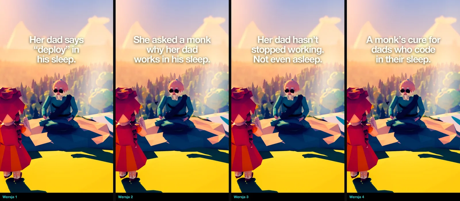
Version one is a fact: dad says “deploy” in his sleep. Funny, but it promises nothing. Version two adds a character who asks. The third brings surprise: he doesn’t stop working even when he sleeps. The fourth promises something concrete: the monk’s cure. With four versions side by side you see at once which one pulls you further. A single version always looks “ok”.
A hook also has to be concrete. Not “This story will move you”, but a number, a person or a situation. “40,000 strangers told her how to be a mom” works, because you get a picture in your head right away: a phone, comments, a tired mom at three in the morning. A generality gives no picture, so it doesn’t stop the thumb. With the reels I record myself, the opening is also rated by a model that predicts reel views before posting. My best reels there usually cut before a second and a half.
The panel goes above the heads, not in a fixed place
White text with a shadow on a bright sky was hard to read. The second iteration is a panel of dark glass in the series color: turquoise for the monk, purple in Few Summers. Two lines at most. The same style of glass bubbles I have on the sites and in the covers, so the reel looks like part of one world.
Then came the question: where should that panel sit? The first rule was “at the top, in the safe zone, unless it covers a head”. Not precise enough. In one frame the panel hung high above the characters and looked detached. In another it touched a forehead.
Now the rule measures from the face: the bottom edge of the panel sits about 60 pixels above the highest head in the frame. Every reel gets its own height:
| Reel | Top edge of the panel (px from the top, frame 1080 × 1920) |
|---|---|
| Few Summers 64 | 614 |
| Few Summers 67 | 554 |
| Monk 34 | 477 |
| Monk 29 | 473 |
| Monk 32 | 385 |
The gap between the extremes is over 200 pixels. If I kept one fixed height, in half the reels the panel would either hang in the air or cover a face. Plus one small fix: capital letters sat in the panel about 0.11 of a letter height too low. On a phone you won’t notice it consciously, but the text looks “crooked”. Same panel, only the text is centered optically.
The compiler won’t build a reel without a hook
The rule “every reel has a hook” would have vanished within two weeks. I know myself. It’s late, the reel is done, you think “I’ll add it tomorrow”. So I turned it into a lock. The compiler that assembles a reel from shots, voice and subtitles refuses to build if a new reel has no hook. From episode 33 of the monk series it also refuses when the hook has no height set.
Second thing: check frames, a few images from a shot computed before the full render, now draw the panel on the shot with the hook. I see the text above the heads before the computer spends an hour computing the whole thing. I wrote about check frames before a Blender render separately. Here there’s simply one more layer to check.
How do you pick a reel cover?
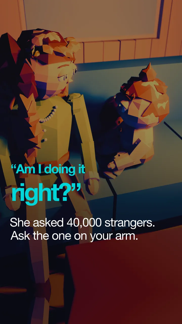
I take a frame without a blink, put the quote on a dark background, and the scene can’t repeat within the last nine covers.
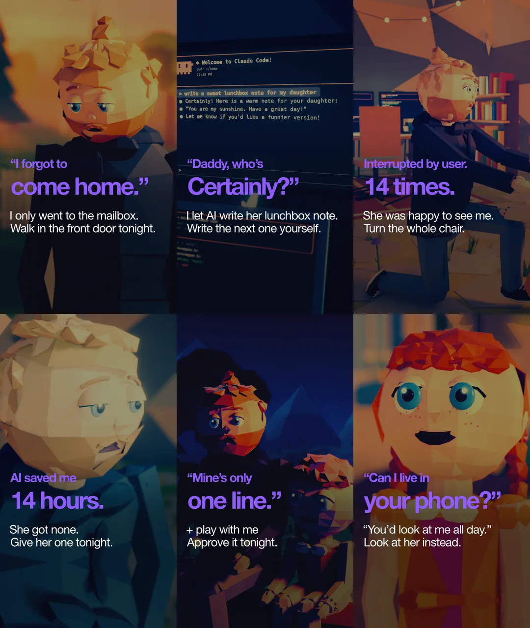
The cover is the second hook. On a profile you don’t see the film, you see a grid of covers, three in a row. That’s where someone decides whether to click. This week I made covers for a dozen or so reels, and every wrong version gave me one rule.
First: a frame with no blink. Characters blink, and a cover is one frame. In episode 31, frame 30 caught a blink, so I took 40. In episode 72 the same thing: 40 was a blink, I took 30. Now I look at the eyes before anything else.
Second: the quote can’t lie on a face or on light clothes. A purple quote on the daughter’s light dress got lost. On dad’s dark sweater it reads at once. So I moved a few covers from her close-up to his, and I shift the image vertically until the quote comes off the chin or the mouth.
Third: no scene twice in the last nine covers. Nine, because that’s how many you see in the grid on a phone’s first screen. Three monks in a medium shot next to each other look like one cover repeated three times. So: campfire, meadow, hut, a terminal at night, and dad’s close-up alternating with the screen.
The last seconds have to say what’s next
The third place is the end. Until now the end card had the punchline and that was it. Now it also has one line that says who to send this reel to, and a pinned comment with the same question. Sharing should be the obvious next step, not something the viewer has to come up with alone.
So that both lines can be read, the end card now lasts 4.5 seconds for the monk and 5.2 seconds in Few Summers. Here a limit kicks in: a monk reel is 30 seconds at most. A longer card eats time from the dialogue. So I shortened lines and recorded the voice again. Episode 37: 30.7 seconds, 28.1 after cutting one line. Episode 39: 30.3, 29.6 after the cut.
I applied the same rules backwards too. Every reel that was finished but not yet published got the “who to send it to” field, the new line on the end card and a caption with a question for the viewer. A few of them already had covers and descriptions ready. I asked myself straight: do they really meet the new rules, or do they just look like it? They didn’t. I redid them.
The last lines should also lift, not bring you down. From episode 32 I took a rule: the punchline ends with something the viewer can do tonight. “Ask the one you’re holding in your arms.” Short, concrete, to one person.
What I take from this
What gave me the most was one thing: I stopped saying “more or less”. Hook at the top, a nice cover, an ending with a punchline. Those were intentions. Now there are numbers: 60 pixels above the head, a 4.5-second card, nine covers without a repeat, 30 seconds for the whole thing. A number can be checked automatically, an intention can’t.
And the second thing: every fix this week started with one bad frame. A blink, a quote on a dress, a panel by a forehead. I didn’t invent rules at my desk. Every wrong version gave me one rule, and every rule went into the tool, so the same mistake doesn’t come back next season.
If you make short films, take one thing for today: write four versions of the first sentence on the same frame and put them side by side. You’ll see at once which one says “stay” and which one only describes the image. And turn the rule you keep forgetting into a lock in your own tool. My memory at 11 pm is weak. The compiler always remembers.
I work with people 1:1 under the delta240mvt brand. On your project, from the first step.
See the offer ↗